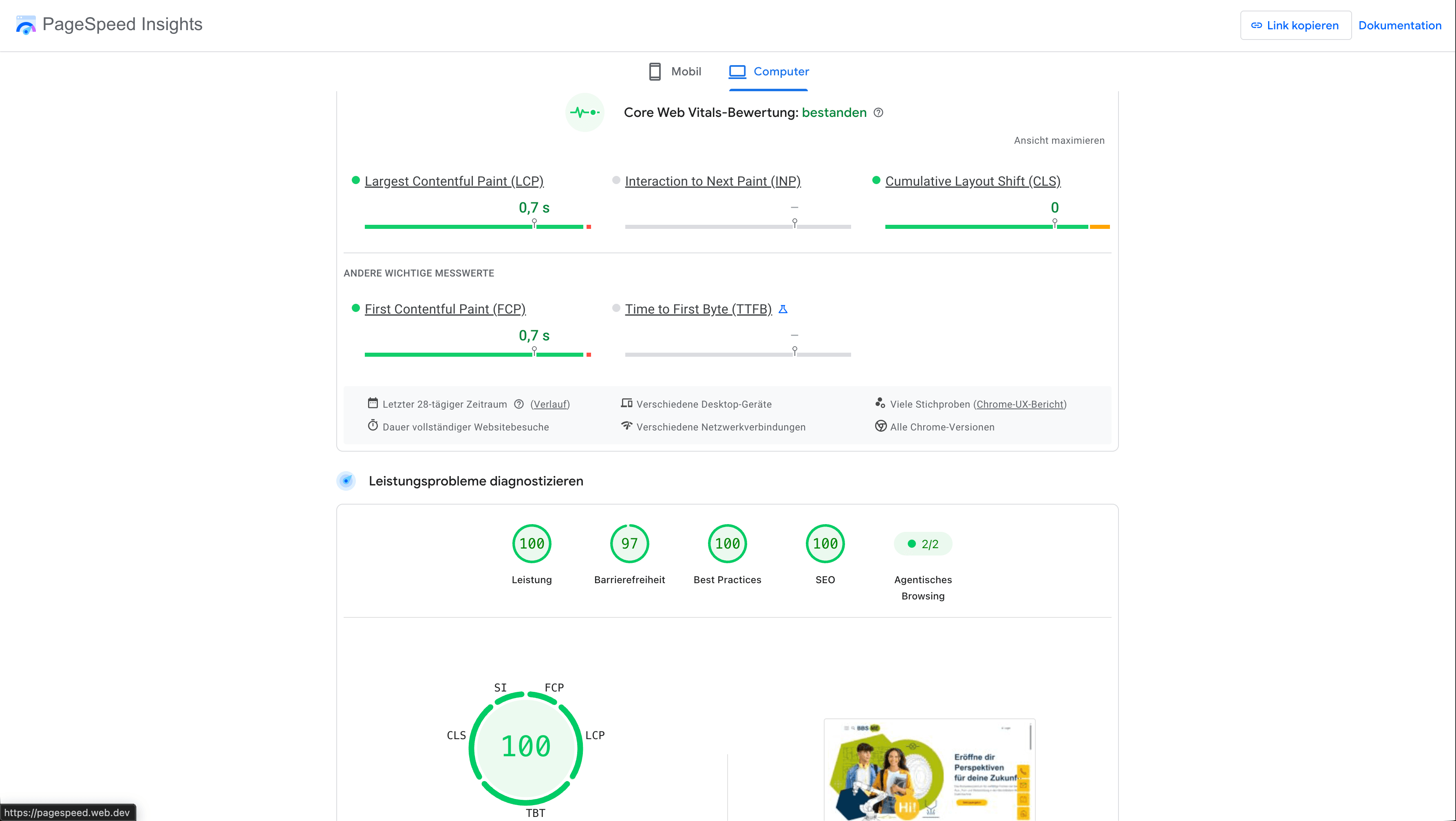
Why fast websites win in the first few seconds
Three seconds often decide whether a click turns into a customer. A prospect lands on your website and waits: no offer, no image, not a single word has appeared yet. It is precisely in those seconds that they decide whether to stay or leave.
The numbers are unambiguous: according to a widely cited Google analysis, more than half of mobile users abandon a page if it takes longer than three seconds to load. That decision is rarely a conscious one. Hardly anyone thinks “this is taking too long”. People simply click back and land on the next search result, often without noticing the actual reason.
For companies this means that a purely technical detail such as load time helps decide how many prospects ever turn into real enquiries, regardless of how good the offer and the content actually are.
This is exactly where the idea of the lightweight website comes in: lightweight websites are, at their core, fast websites. They are built lean enough to use that short but decisive window rather than lose it.
Why “more” does not automatically feel “better”
A convincing website should show as much as possible, many people assume at first: more images, more text sections, more features covering the entire range of services. Yet that often produces the opposite effect. A packed home page overwhelms visitors rather than convincing them. They do not know where to look first and lose the very interest that brought them there.
On a first visit, people behave much like someone leafing through a brochure: they skim before they read. Only when something holds their attention do they take a closer look. A website that presents too many equally weighted pieces of information at once gives the eye nothing to hold on to. There is no clear focal point when everything shouts equally loudly.
A useful comparison: a deliberately reduced website works like a well-arranged shop window. Not every product is on display at the same time, only what is meant to make an impression, while the rest deliberately steps back. That same principle transfers to a website without making it feel empty or careless.
There is an interesting side effect that is rarely considered: what is reduced in terms of content is usually lighter in technical terms too. Fewer elements on a page generally mean less data to load. Clarity and loading speed are more closely connected than they first appear.
The double price of an overloaded, slow website
A slow website does not only cost direct enquiries. It also affects how easily the site is found at all. Search engines such as Google treat load time as one of several factors influencing how high a website appears in search results. A fast website therefore has better odds of being seen in the first place, and it forms the technical foundation for any search engine optimisation built on top of it.
This becomes particularly clear with local searches. If someone on the move searches for “tradesperson near me”, they usually compare several results within a few seconds. The website that responds first has a clear advantage, regardless of who would actually have the better offer.
Speed also shapes how the company itself is perceived after the click. Most prospects research online before they contact a business or buy from it. A website that loads hesitantly or feels cluttered often creates exactly the first impression you wanted to avoid, before a personal conversation has even started.
Why this carries more weight today than it used to
Only a few years ago, a website was primarily designed for the screen on a desk. That has since reversed. Around two thirds of all page views worldwide now come from smartphones. Anyone visiting a website today usually does so on the move, often with less patience and a weaker internet connection than at a desktop computer.
This amplifies the effect of a slow or cluttered page. What still looks tidy on a large screen can quickly become restless on a small display. And what is barely noticeable on office Wi-Fi becomes far more apparent on a mobile network.
A website that is designed for desktop first and only adapted for mobile afterwards is planning against actual user behaviour. Mobile first therefore reverses that order from the outset, and it is part of every responsive web design project we take on. How a website is built shows not only in how it is operated, but also in how many resources it consumes on every visit.
The sustainability effect hardly anyone mentions
A company's energy consumption no longer arises only in the office or in production, but also in digital operations, for example through its own website. Larger, technically more elaborate websites require more energy than leanly built pages, because more data has to be transferred.
For companies, that produces an argument almost by itself. Anyone who chooses images deliberately instead of using them liberally, leaves out unnecessary scripts and keeps the code lean does not have to pursue sustainability as a separate effort. It arrives as a by-product of a technical decision that makes sense anyway.
How sustainable your own website actually is can be measured rather than estimated. The website sustainability scanner at nachhaltigewebsite.jetzt (German-language) checks a page’s CO₂ footprint free of charge and shows how strongly data volume and loading behaviour translate into energy consumption. The result gives a concrete starting point for deciding where a reduction pays off most.
Fewer elements, greater impact
A lean website is not defined by offering as little content as possible, but by concentrating on what matters. Every element serves a purpose: a clear headline conveys the central message, sufficient white space creates orientation, a legible typeface provides calm and authentic images strengthen credibility. Anything without recognisable value is deliberately left out. That prioritisation is the actual work in UX and UI design.
This reduction affects more than the design. Every additional animation, every large image and every embedded script increases the amount of data, extends the load time and ties up further server resources. Conversely, every element deliberately left out means less ballast, which benefits both the users and the technology behind the scenes.
That is exactly why design, performance and resource efficiency are not separate decisions. Structuring a website clearly and reducing it to the essentials improves its speed, makes it easier to use and lowers the technical overhead at the same time. A light website is not the result of individual optimisation measures, but of one consistent principle: every element has to earn its place.
What makes the difference
How strongly this principle affects a website is best shown with a concrete example. The difference between an overloaded and a reduced website becomes clearest in a direct comparison. The following juxtaposition shows two home pages with the same content but different execution: one with many elements, one deliberately reduced.
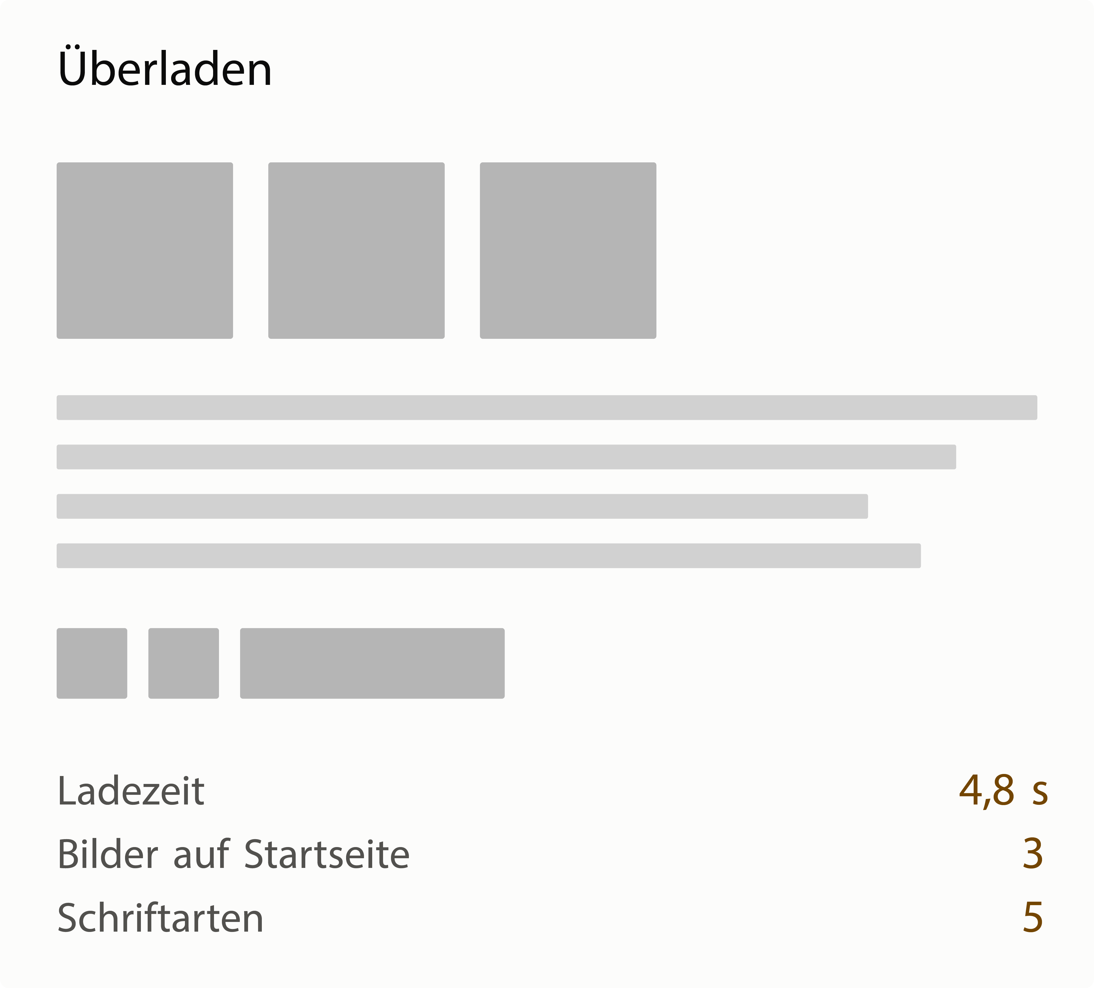
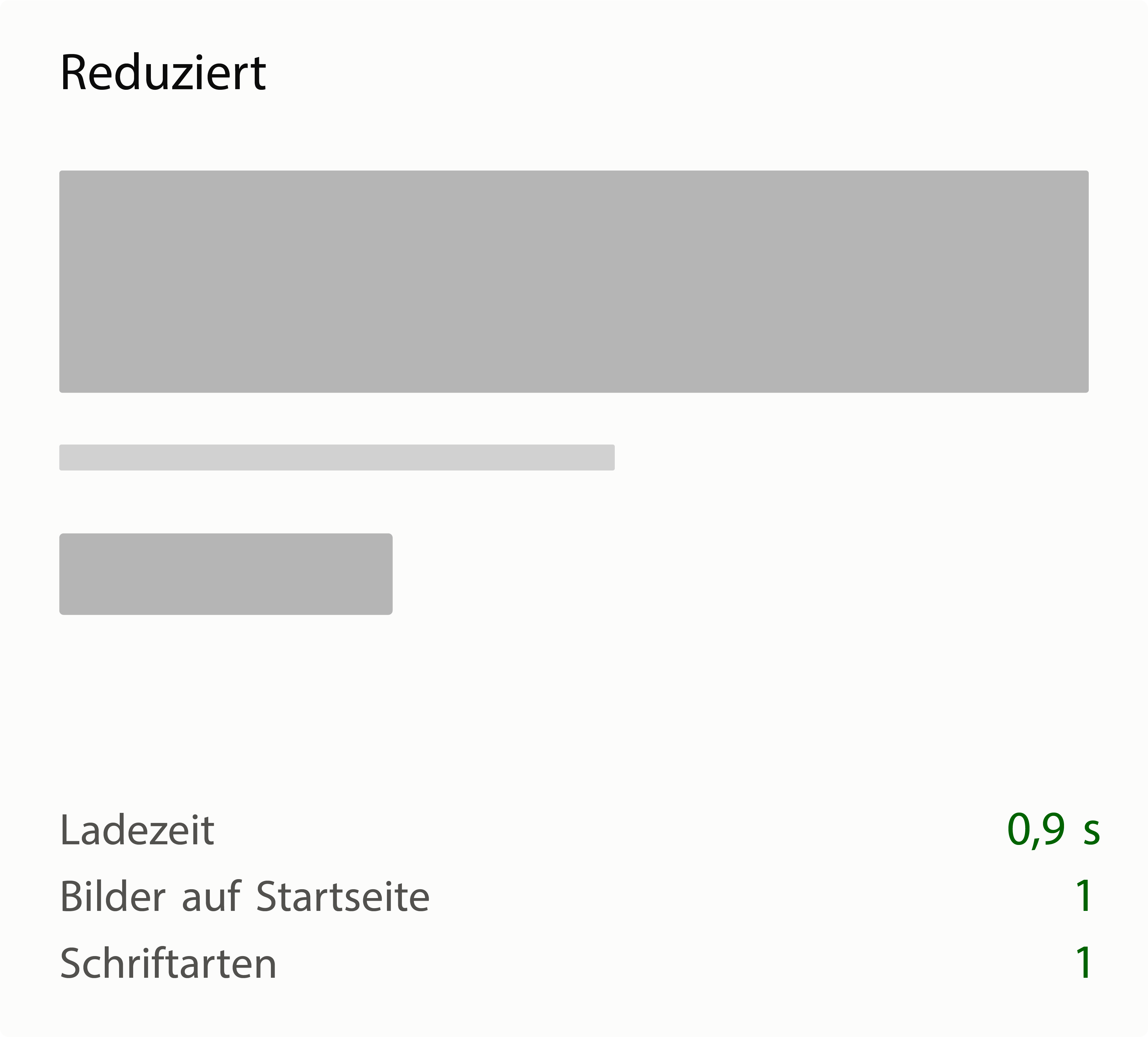
The difference lies not in the content, but in how much of it is shown at once.
Several images, various typefaces and many text sections add up to a website that shows a lot but also takes correspondingly long to load all of it. The reduced variant does without some of these elements and therefore reaches a fraction of the load time. No content is lost, only the order in which it becomes accessible changes. This connection between the number of elements and the load time is exactly what the figures in the comparison show.
Why the technology behind the scenes matters too
Not every modern website is automatically lean. How a page is built technically often decides more about load time in web development than the design itself. Many sites first load the complete technical scaffolding of the page, even when a visitor only wants to read a single paragraph of text. On a conventionally built website, the entire code for the whole page is often transferred, including areas nobody interacts with.
Newer approaches distribute that effort more selectively. Only the areas that genuinely need interaction, such as a contact form, a price calculator or a booking calendar, receive the technology required for it. The rest of the page stays simple content that loads quickly. In practice the amount of data transferred can therefore be a fraction of what a conventionally built page with a comparable feature set requires.
In other words: a website can still load quickly even with more extensive functionality such as appointment booking, provided the underlying technology is applied selectively instead of burdening the entire page with the same technical overhead.
| Technology | Advantage | Drawback | Suited to |
|---|---|---|---|
| Astro (islands architecture) | Only loads the genuinely interactive areas as JavaScript; the rest stays static HTML | Requires developers to get familiar with a still relatively young concept | Content-heavy websites with individual interactive elements such as forms or filters |
| Plain HTML, CSS and JavaScript without a framework | Minimal load time, because no additional framework code is transferred | Recurring building blocks such as navigation or footer have to be maintained by hand | Smaller websites with few pages and a manageable feature set |
| React or Next.js with classic hydration | Very large ecosystem of ready-made building blocks and extensions | Usually loads the entire framework on first visit, including for non-interactive areas | Extensive, highly interactive applications such as customer portals |
| WordPress with a classic theme and page builder | Very widespread, large choice of themes and extensions, easy to maintain without programming knowledge | Additional plugins and page builders often bring unused code that increases load time | Companies with frequently changing content that maintain the site themselves without a dedicated development team |
Content website or web application: an important distinction
Which of these technologies is suitable depends largely on what kind of website it is. Broadly speaking, there are two types.
A content website primarily provides information: text, images, an offer, ways to get in touch. Visitors read, look around and interact only occasionally, for example through a contact form or a filter. Company websites, blogs, catalogues and portfolios typically fall into this category, whether or not a CMS such as WordPress sits behind them. They are well served by approaches that treat most of the page as simple, quickly loadable content and only make individual areas technically more elaborate.
A web application, by contrast, works more like a digital tool. Users manage data, make continuous inputs or edit content in real time, for example in a customer portal, a booking system or a project management tool of the kind that emerges when you have a platform built. Here a large part of the page is interactive anyway, which is where the consistently technical setup offered by classic frameworks plays to its strengths.
Most company websites sit closer to the first type, even when individual features such as appointment booking are added. What matters is not whether interactivity is needed at all, but how large its share of the overall page is. That assessment determines which of the technologies presented here actually fits the project at hand.
This classification shows that there is no single right technology for every website, only the right one for the respective use case. Modern web development increasingly relies on approaches that send as little unnecessary code to the browser as possible. Frameworks such as Astro pursue this particularly consistently, but Next.js has also made great progress with Server Components, because they let a large part of the page render on the server so it never reaches the visitor as JavaScript in the first place. Ultimately what counts is not the tool, but that the chosen technology fits the project and enables a fast, reliable website.
What partial hydration and the islands architecture are about
On conventionally built websites based on a modern JavaScript framework, the browser first loads the complete code for the entire page before it becomes fully usable. This process, known as hydration, turns the initially static HTML into an interactive page. The problem: even plain text sections or images that nobody interacts with are technically “activated” in the process, although that would not be necessary at all.
The islands architecture handles this more selectively. The page is first delivered entirely as simple, quickly loadable HTML (the page source code). Only where interaction is actually meant to happen, for example an image carousel, a shopping cart icon or a contact form, is additional code loaded on purpose. These individual interactive areas are referred to as “islands” because they work independently of one another, while the rest of the page remains plain HTML.
This targeted approach brings two practical benefits. First, the individual interactive areas load in parallel and independently, so an elaborate element further down the page does not delay the immediate rendering of the more important areas further up. Second, it can be defined for each island when it is activated: immediately, only once the user scrolls that far, or only when the browser is not busy with anything else. An image carousel a visitor never sees therefore causes no additional loading effort either.
For a project this means in practice: the website can contain very extensive interactive features in specific places without those slowing down the rest of the page. The technical effort is invested exactly where it makes a difference, and nowhere else.
Accessibility as a by-product of good structure
Since June 2025, the German Accessibility Strengthening Act (Barrierefreiheitsstärkungsgesetz, the national implementation of the European Accessibility Act) has required many companies to offer accessible digital services. Independently of that legal basis, accessibility is also worth it from a practical point of view.
A website built on a clear, semantically meaningful structure instead of technically nested content is generally more accessible by default, for example for screen readers or for users who navigate by keyboard rather than mouse. The same structure that makes a website fast and easy to navigate therefore also benefits accessibility, without requiring separate effort. Our free accessibility check shows where your website currently stands, and we support the implementation as an agency for accessible websites.
Core Web Vitals: the metrics behind fast websites
Talking about a fast website sounds like a subjective impression at first. Google, however, has translated that impression into three concrete, measurable values summarised under the term “Core Web Vitals”.
- Largest Contentful Paint measures how long it takes for the largest visible element of a page to load, usually a main image or a large headline. Under 2.5 seconds counts as good.
- Interaction to Next Paint measures how quickly a website responds to an input, such as a click or a tap on a smartphone. The threshold here is 200 milliseconds.
- Cumulative Layout Shift captures how much content still moves around while loading, for example when a button only slides into its final position after an image has loaded. A good value here is below 0.1.
These three values feed into Google's assessment as part of page experience. They do not replace good content, but they can tip the balance between pages of comparable relevance. At least as important is their effect on visitor behaviour: websites that meet all three thresholds see noticeably lower bounce rates in practice than websites that miss one or more of them. According to Chrome user data (CrUX), only around half of all mobile websites currently meet all three values at the same time, an indication of how much potential is left unused here.
Machine readability: staying visible for AI systems too
More and more people no longer search on Google in the classic sense, but put their question directly to an AI system such as ChatGPT, Perplexity or Gemini. These systems often answer immediately, with a concrete recommendation instead of a list of links. For companies that creates a new prerequisite for visibility, which is what GEO (Generative Engine Optimization) addresses: a website has to be understandable not only for Google, but also for the language models behind those answers.
The decisive difference lies in how these systems read a website. A classic search engine crawler usually evaluates a page as a whole. A language model, by contrast, breaks a page down into individual passages and looks specifically for the one that answers a given question most precisely. A website with clearly structured content, unambiguous headings and clean, semantically meaningful HTML is considerably easier to evaluate in that process than a page whose content is technically nested or unstructured.
That brings a property to the fore which already plays a role elsewhere in this article: a clear, reduced structure instead of technical arbitrariness. The very same structure that makes a website easy to navigate for people and easy to find for Google also makes it easier for AI systems to capture its content correctly and take it into account in their answers. Anyone already paying attention to clarity and clean structure has therefore already laid an important part of the groundwork for this development. We have summarised the further steps in our post How can I prepare my website for AI?; our free AI readiness check gives a first impression.
Conclusion: why fast websites win people over
The first few seconds of a website visit cannot be extended. They can, however, be used better. Fast websites make content visible sooner, help visitors orient themselves more easily and create a positive first impression. That benefits not only the users, but also visibility in search engines. At the same time, resource consumption goes down.
“Less” does not mean doing without information or design. It means deliberately concentrating on what genuinely helps the visitor. Every element with a clear purpose strengthens the website. Everything else costs attention, extends the load time and, in the worst case, makes potential customers leave the page early.
Reviewing your website regularly for clarity, speed and data load is therefore an investment in a better user experience, and at the same time the foundation for more enquiries and new customers. If it becomes clear that an existing site is reaching its limits, a website relaunch is usually the more honest route than further patching. Feel free to get in touch: contact or request a quote directly.